IBM Landing Page
Web Design | UI
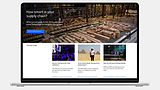
I’ve been working on the IBM Home team page, where I regularly updated the UI and visuals to keep things nicely structured and engaging. I collaborated with writers and content creators to figure out the best way to feature new stories, product launches, and company updates.
UI & UX
For this page layout, I used an 8-column grid system—kind of like building with LEGO blocks. The 2x Grid concept is all about dividing space into even sections—2, 4, 8, 16, up to 64 columns—which helps create a clear structure and rhythm.
Since we had weekly updates to images and content, this block-based layout made it super easy to swap or adjust sections without disrupting the overall design. As a result, each monthly page felt familiar and consistent, but still had its own unique look.